Taste Tester App
Gamifying the restaurant ordering experience
A high-fidelity mobile app prototype that gamifies restaurant menu navigation. Pitched, approved, designed, and presented in a 2-week sprint for St. Edward's University. Through user research, wireframing, and iterative feedback, this project earned an A by solving decision paralysis with playful discovery.

Key Results
The Problem
What if choosing food felt like playing a game instead of making a high-stakes decision?
That question launched this 2-week class project. I pitched a mobile app concept targeting two pain points:
📄Menu Legibility — Physical menus are cluttered and hard to read. Small fonts, poor contrast, and information overload make decision-making exhausting.
🤔Decision Paralysis — Diners order the same meals repeatedly because they're afraid of wasting money on something they won't like.
After getting professor approval, I conducted 3 user interviews to validate the problem:
"I always order the same thing. It's safe." — All 3 participants
"I don't want to waste $15 on something I hate." — 2 of 3 participants
"I have to call restaurants ahead to ask about allergens." — Participant with dietary restrictions
The Solution
I designed a mobile app that turns meal selection into a game. The high-fidelity prototype included three core features:
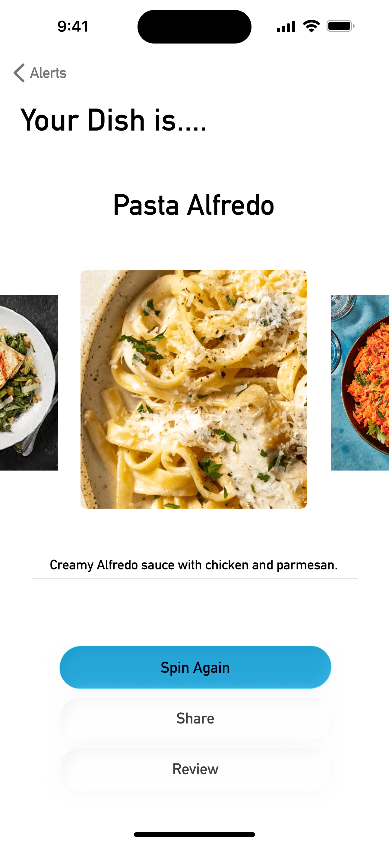
🎡Spin the Wheel — An interactive mechanic that randomly selects dishes based on your preferences. The choice feels exciting, not risky.
📱Readable Digital Menus — Clean, searchable restaurant menus with prominent allergen information.
📝Personal History — Track dishes you've tried and rate your experiences, building confidence for future choices.
The insight: People aren't afraid of new food—they're afraid of wasting money. When the choice feels playful instead of permanent, exploration becomes exciting.
The Process
The Pitch
The Pitch
Week 1, Day 1: I pitched the concept to my professor with a single question:
"What if choosing food felt like a game instead of a high-stakes decision?"
I presented:
The professor approved it—with one condition: validate the problem through real user interviews before designing anything.
Pitch Deck
Pitch Deck
I created a pitch deck to communicate the concept visually. It outlined the problem space, proposed solution, target users, and design approach.
The deck helped me articulate the value proposition clearly before diving into research and design.
User Research
User Research
Week 1, Days 2-3: I conducted 3 user interviews with different types of restaurant-goers to understand their ordering behaviors.
Participant Profiles:
The "Aha" Moment:
"Picky eating" isn't one problem—it's three completely different user needs. This insight fundamentally shaped my approach: instead of designing one feature, I needed to create a flexible system that served all three personas.
User Personas
User Personas
From the 3 interviews, I developed three personas representing distinct user needs. Each would guide specific design decisions:
Toni
Allergy-Aware · Shellfish & Tree Nuts · Age 24
"I want to try new places with friends, but I spend the whole meal worried I'll accidentally eat something that'll send me to the ER."
🎯 Goals
- •Find restaurants with safe options BEFORE arriving
- •Order confidently without interrogating the waiter
- •Not be "the difficult one" in the friend group
😤 Frustrations
- •Menus rarely list allergens clearly
- •Cross-contamination concerns aren't addressed
- •Has to call restaurants ahead to ask questions
Jamie
Texture-Sensitive · "Picky Since Childhood" · Age 29
"I know it's weird that I don't eat most vegetables. I've tried. It's a texture thing."
🎯 Goals
- •Find dishes that match specific texture preferences
- •Avoid embarrassment when ordering "plain" versions
- •Slowly expand comfort zone without pressure
😤 Frustrations
- •Feels judged for food preferences
- •Menu descriptions don't mention textures
- •Doesn't want to try something expensive and hate it
Aiden
Decision Fatigued · "Too Many Options" · Age 31
"I'm not picky about food—I'm picky about decisions. Just tell me what to get."
🎯 Goals
- •Spend less time deciding, more time eating
- •Discover new favorites without endless research
- •Trust recommendations based on past likes
😤 Frustrations
- •Overwhelmed by large menus
- •Spends 20 minutes choosing, then regrets it anyway
- •Review apps have too many options, not enough curation
Paper Wireframes
Paper Wireframes
Week 1, Days 4-5: I started with paper sketches to rapidly explore layouts and interactions without committing to digital design.
Key Questions:
Paper prototyping let me test 6-7 variations in a few hours, thinking through the complete user journey before opening Figma.

Digital Wireframes
Digital Wireframes
Week 1, Days 6-7: After validating paper concepts, I created digital wireframes in Figma to establish the complete user flow:
1. Home → Entry point with clear calls-to-action
2. Search/Import → How users discover and add restaurants
3. Spin the Wheel → The core gamified interaction
4. Review → Post-meal rating and feedback
These wireframes focused purely on structure and flow—no visual design yet. I refined:
The four screens below show the complete low-fidelity flow:


Mid-Week Review & Feedback
Mid-Week Review & Feedback
End of Week 1: I presented my wireframes to my professor for a checkpoint review.
✓ What Worked:
"The Spin mechanic directly addresses decision paralysis. This is the core value."
✗ What Needed Work:
"Would users with allergies trust a random selection? Safety has to come first."
"If users can browse the full menu before spinning, they'll fall back into analysis paralysis. Rethink the flow."
This feedback fundamentally changed my approach for Week 2.
Iteration & High-Fidelity Design
Iteration & High-Fidelity Design
Week 2, Days 1-4: Based on feedback, I made three critical changes:
1. Allergen Alerts as Interrupts
Elevated allergen warnings to full-screen interstitials that appear BEFORE the dish reveal. Safety isn't optional—it's mandatory.
2. Spin-First, Browse-Later
Restructured the flow: users spin immediately after setting preferences. The full menu is a secondary option, preventing analysis paralysis.
3. "Spin Again" as Primary Action
After seeing a result, users can re-spin with one tap. The experience stays playful—you're not locked into any choice.
For the high-fidelity visual design, I drew inspiration from video game UI:
🎮Loot Box Mechanics (CS:GO, Overwatch) — The "Spin" treats dish discovery like unlocking a rare item, creating anticipation instead of anxiety
🏆Mission Results (Hitman, Cuphead) — The review screen mimics post-game summary screens, making rating feel like completing a challenge
🔬Portal's Aperture Science — Clean, geometric, slightly sci-fi aesthetic that feels modern and playful
The gaming inspiration wasn't just aesthetic—it solved a psychological problem. Loot boxes reduce regret ("you didn't choose wrong, chance did"), directly addressing the "fear of disappointment" from user interviews.
The final "Spin" interaction (shown below) reveals dishes with excitement, not stress:

Final Prototype & Key Features
Final Prototype & Key Features
Week 2, Days 5-6: I finalized the clickable prototype in Figma, covering three complete user flows:
📍Import Menu — Search for restaurants and digitize their menus with clear allergen labeling
⚠️ Allergen Alerts — Prominent safety warnings that interrupt the flow before dish selection (shown below, left)
📚Visited Places — Personal history tracking dishes you've tried and rated (shown below, center)
These features directly addressed the needs of all three personas: Toni (allergen safety), Jamie (building confidence), and Aiden (eliminating decision fatigue).


Final Presentation
Final Presentation
Week 2, Day 7: I presented the prototype to my professor and class, walking through:
- •Problem validation from 3 user interviews
- •How personas (Toni, Jamie, Aiden) drove design decisions
- •The wireframe-to-prototype evolution based on mid-week feedback
- •Three key features: gamified selection, allergen safety, personal history
- •Gaming UI inspiration and the psychology behind it
Professor Feedback:
✓ "The gamification approach effectively addresses the problem you identified"
✓ "Strong user research foundation—the personas clearly informed your design"
✓ "High-fidelity prototype demonstrates polish and attention to detail"
✓ "Allergen safety features show thoughtful consideration of diverse user needs"
Final Grade: A
Outcomes & Impact
The project earned an A grade after completing a full design cycle in 2 weeks: Pitch → Approval → Research → Personas → Wireframes → Feedback → Iteration → Presentation.
🎯Design Impact:
💡Key Insights:
🏆Professor Feedback:
"Innovative approach to a common problem... strong user research foundation... high-fidelity prototype demonstrates polish and attention to detail... allergen safety features show thoughtful consideration of diverse user needs."
Retrospective
What I Learned:
1. Pitch First, Design Later
Requiring professor approval before designing forced me to articulate the problem clearly. That clarity carried through the entire project—I always knew what I was solving and why.
2. Small Research, Big Insights
3 interviews were enough to uncover that "picky eating" isn't one problem—it's three. I didn't need 50 participants. I needed the right 3.
3. Constraints Breed Focus
The 2-week timeline meant I couldn't build everything. No order-ahead feature. No social sharing. No loyalty program. This forced me to perfect the core mechanic (the spin) instead of building five mediocre features.
4. Feedback Prevents Failure
The mid-week professor review caught a critical flaw: letting users browse the full menu before spinning would have caused the analysis paralysis I was trying to solve. Without that checkpoint, the whole concept would have failed.
5. Borrow From Unexpected Places
Gaming UI wasn't just aesthetic—it solved a psychological problem. Loot boxes reduce regret ("you didn't choose wrong, chance did"), directly addressing the "fear of disappointment" identified in interviews.
What I'd Do Differently:
University Campus Map
Interactive Wayfinding Application
