Spicy Boys Food Truck
Self-Service POS System (UX Case Study)
A customer-facing digital ordering system for an Austin food truck that transforms the ordering bottleneck into a streamlined, customization-friendly experience. Designed around real user research and the motto: "the food tastes better when the wait feels shorter."

Key Results
The Problem
I was standing in line at Spicy Boys on a 98°F Austin afternoon, watching a guy in front of me try to explain "medium-hot but not too hot" to a stressed cashier while 15 people waited behind him. That's when I realized: this food truck's biggest problem wasn't the food—it was the ordering experience.
From my 8 customer interviews, the frustrations were consistent:
"I ordered 'hot' last time and couldn't eat it. This time I said 'mild' and it had no flavor." — Regular customer
"I have 45 minutes for lunch. I can't spend 20 of them standing in the sun." — Office worker
"I wanted to ask about vegan options but the line was too long to hold everyone up." — First-time visitor
The data confirmed it: average wait times hit 15 minutes during lunch rush. The owner estimated 30% of potential customers walked away when they saw the line.
The Solution
I designed a self-service kiosk guided by three principles:
1. Make Customization Foolproof
Spice level selection isn't optional—it's required. No more "I thought I said medium" conversations.
2. Respect the Clock
Lunch break customers need speed. Every tap should move them closer to food, not deeper into menus.
3. Free Up Staff for Food, Not Orders
The best food trucks have one person taking orders and one cooking. What if zero people took orders?
The result: a tablet-based ordering system where customers build their order, pay, and wait comfortably for a text notification—while staff focus entirely on cooking.
The Process
Contextual Inquiry & Research
Contextual Inquiry & Research
I conducted on-site research at the Spicy Boys food truck during peak lunch hours to understand the physical environment and real user pain points.
Research Methods:
Key Findings:
This on-site research revealed insights that surveys alone would have missed, particularly around the urgency of lunch breaks and the importance of customization accuracy.
User Personas
User Personas
From my 8 customer interviews, three distinct user patterns emerged. These personas represent real people I spoke with during the lunch rush.
Marcus
Office Worker · 45-min Lunch Break · Age 32
"I literally timed it last week—22 minutes from getting in line to getting my food. That's half my lunch."
🎯 Goals
- •Order quickly without waiting in line
- •Get exactly the spice level he wants
- •Eat in his air-conditioned car
😤 Frustrations
- •Unpredictable wait times
- •Spice levels are inconsistent
- •Can't browse menu while waiting
Priya
Vegan · Dietary Restrictions · Age 28
"I want to ask about ingredients but I feel bad holding up the line behind me."
🎯 Goals
- •Verify vegan options before ordering
- •Customize without judgment
- •Not be "that person" asking questions
😤 Frustrations
- •Menu doesn't clearly mark dietary info
- •Feels rushed by people waiting
- •Has to shout over crowd noise
Tyler
Spice Enthusiast · Regular Customer · Age 25
"Their 'extra hot' is perfect, but I ordered it once and got mild. Never again."
🎯 Goals
- •Get consistent spice levels every time
- •Try new menu items with confidence
- •Skip the line as a regular
😤 Frustrations
- •Spice level depends on who's taking orders
- •No way to save favorite orders
- •Staff turnover means re-explaining preferences
User Flow: The Happy Path
User Flow: The Happy Path
I designed the core task—ordering the signature Spicy Chicken Sandwich—with customization as a first-class feature.
The flow:
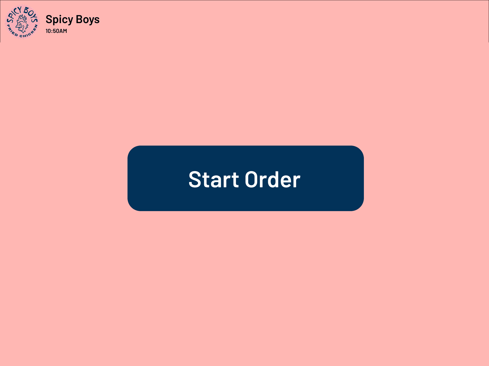
1. Welcome: User taps "Start Order" to begin
2. Menu Browsing: User navigates categories and selects "Spicy Chicken Sandwich"
3. Customization (Critical): System requires a "Spice Level" selection to ensure satisfaction. Optional modifiers like "Add Cheese" (+$1.00) or "Extra Pickles" are clearly priced
4. Cart Review: All active modifiers are displayed so users can verify accuracy
5. Additional Items: User can add sides, customize those as well
6. Checkout: Review order, select tip, proceed to payment
7. Payment: Complete transaction
8. Confirmation: Receive order number and pickup instructions
Each step is designed to minimize friction while ensuring customization accuracy.
Key Design Decisions
Key Design Decisions
Not every idea survived testing. Here are the decisions I made—and the ones I had to kill.
✗ KILLED: Optional Spice Selection
My first design made spice level optional with a default of "Medium." In testing, 3 of 5 users skipped the selection entirely and later complained: "I didn't see where to pick the heat." I made it required—you literally cannot add to cart without choosing.
✗ KILLED: Detailed Ingredient Lists
I initially showed full ingredient lists on the menu. Users found it overwhelming: "I just want to see the food and the price." I moved ingredients to a "More Info" tap, which only 1 in 5 users actually used.
✗ KILLED: Scroll-Based Menu
My first layout was a single scrolling page of all items. Users missed entire categories. I switched to tabbed navigation (Sandwiches, Bone-In, Nuggets, Sides, Dessert) and discovery improved dramatically.
✓ KEPT: Giant Food Photos
Some stakeholders wanted smaller images to fit more items. But testing showed users made decisions faster with large, appetizing photos. "I know what I want just looking at it" — Tyler, research participant.
✓ KEPT: Sticky Cart Summary
The cart total stays visible at all times. Marcus specifically praised this: "I always want to know what I'm spending before I get to checkout."
✓ KEPT: Order Number, Not Name
I considered calling names like Starbucks. The owner pushed back—"We're too loud for that." Order numbers displayed on screen work better for a food truck environment.
High-Fidelity Design & Prototyping
High-Fidelity Design & Prototyping
I created a clickable prototype in Figma that follows the complete user journey from welcome to confirmation, testing each interaction for clarity and speed.
The 9 screens below show the complete ordering flow: Welcome → Menu → Customization → Cart → Sides → Side Customization → Checkout → Payment → Confirmation.
Design Decisions:
Prototype Testing:


The User Journey
The User Journey
The final design addresses each persona's core needs:
👨💼 Marcus → Orders in under 2 minutes, eats in his car with 30+ minutes to spare
🌱Priya → Filters for vegan options, customizes without holding up anyone, orders with confidence
🌶️ Tyler → Selects "Extra Hot" himself, gets consistent spice every time, no miscommunication
The ideal journey:
1. Approach: Customer sees the self-service kiosk and skips the line entirely
2. Browse: Large food photos and tabbed categories make decisions fast
3. Customize: Required spice selection + optional modifiers ensure accuracy
4. Pay: Tip options, card payment, done in seconds
5. Wait: Text notification means they can sit in shade or their car
6. Pickup: Order number on screen, grab and go
The experience shifts from a 15-minute bottleneck to a 2-minute self-service flow.
Outcomes & Impact
The self-service kiosk design transforms the Spicy Boys ordering experience from a bottleneck to a streamlined operation.
Prototype Testing Results:
Expected Business Impact (Based on Design):
The design ensures customers can customize confidently, wait comfortably, and pick up instantly—making "the food taste better, the wait feel shorter, and customers far more likely to come back."
Retrospective
Constraints I Worked Within:
Collaboration:
I worked directly with the Spicy Boys owner, who was skeptical at first: "Our customers like talking to us." After I showed him the research—particularly the quotes about inconsistent spice levels—he became an advocate. His input shaped the order number system (instead of names) and the tip screen placement.
What I Learned:
1. Be Where Your Users Are
Three hours standing in the Texas heat taught me more than any survey could. I felt the frustration of waiting, heard the miscommunications happen in real-time, and watched people walk away from long lines. Contextual inquiry isn't optional—it's essential.
2. Constraints Force Clarity
Four weeks meant I couldn't design everything. No loyalty program. No order-ahead. No staff dashboard. This forced me to perfect the core flow instead of building mediocre versions of five features.
3. Required Fields Aren't Always Bad UX
Making spice level required felt "friction-y" at first. But the research was clear: optional fields led to customer complaints. Sometimes friction prevents bigger problems.
What I'd Do Differently:
Taste Tester App
Gamifying the restaurant ordering experience
